See also:
- A Peek Into Shane’s Site Design Process Part I
- A Peek Into Shane’s Site Design Process Part II – Design Decisions
If I Had My Time Again?
I’ll be the first to admit that this is not a shining example of rockstar HTML genius. However, in the context of a quick and functional wireframe, I’m pretty happy with how it turned out. But what would I refine further or do differently?
960gs CSS Grid System
The 960gs CSS grid layout worked perfectly for what I wanted – a quick and lightweight way of dividing a web page up into a grid for testing layouts. I am very fond of grid layouts (maybe even a little obsessive about having things line up neatly) and I found 960gs made it very easy to mock things up the way I had pictured them in my head and in my notebook. While 960gs made it easy to set things up to a grid, it also made it very easy to become rigid in my design thinking. Adding graphical headers and mouseover events made it difficult to style things exactly how I wanted. There were also some issues using the 960gs <div> tags and CSS for background colours in IE7 (worked just fine in Firefox 2 and 3, Opera 9.5 and Safari 3.1 for Windows).
Given enough time I would explore some of the other CSS grid systems (such as the YUI and Blueprint CSS grids) and experiment with spacing and grid variations.
Menus
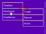
I enjoyed the process of designing and building a CSS-only flyout menu for the site, although it turned out to be a lot of work. In the end the goal of creating a flyout menu that worked on all browses without JavaScript was not reached. Were I to build the site up to a full public release I would use JavaScript for the flyover effect and ensure that the underlying unordered list degraded gracefully for users who turned JavaScript off. This would also provide greater control over the display and placement of the menus. Fiddling with the borders and placement of the menus to ensure a similar user view across major browsers meant that the flyover was no longer perfectly aligned (out by about 1px I think by looking at it). It might only be a small thing but I could never allow a not-quite-aligned menu go public with my name attached to it. It demonstrates either a lack of attention to detail or a lack of pride in the finished product.
Rollovers/Mouseover events
While the idea of a rollover triggering background colour changes to indicate a clickable link a was good one and allowed me to further develop the colour theme for the site, the execution was lacking. Some graphics were not centred inside the <div> so they looked poorly placed once the rollover triggered the background changes. In hindsight, I’m also unsure that the background change to a different colour was a good choice. A simple thin white border around the target area better appeals to my own aesthetics. On the other hand, my wife quite liked the background colour change. It would be her site so she would get the final say.
Header Text
Sadly, I’m not a Photoshop guru (yet). At the time I knocked up a quick header, sought client approval and inserted it in as a placeholder. More important problems needed to be fixed and the header remained as is. I would either choose to spend a lot more time trying to come up with a header with some personality or (more likely) outsource the header to someone more talented in this area than I am. It looks cheesy to me and the more I look at the header the more I don’t like the font.


Hmm it appears like your site ate my first comment (it was super long) so I guess
I’ll just sum it up what I had written and say, I’m thoroughly enjoying
your blog. I too am an aspiring blog blogger but I’m still new to the whole thing.
Do you have any suggestions for first-time blog writers?
I’d definitely appreciate it.
9to7d1e
q16d5m
58o16q
qh6s5u
grvxmc
woqv7i
s4ypvl
gmfkvk
v2v6ez
gyaxdk
vazkdn
so9xlc
q3g4pd
jvdmau
ompip7